Paired App helps couples to stay in love through daily questions, games, quizzes and expert-backed tools.
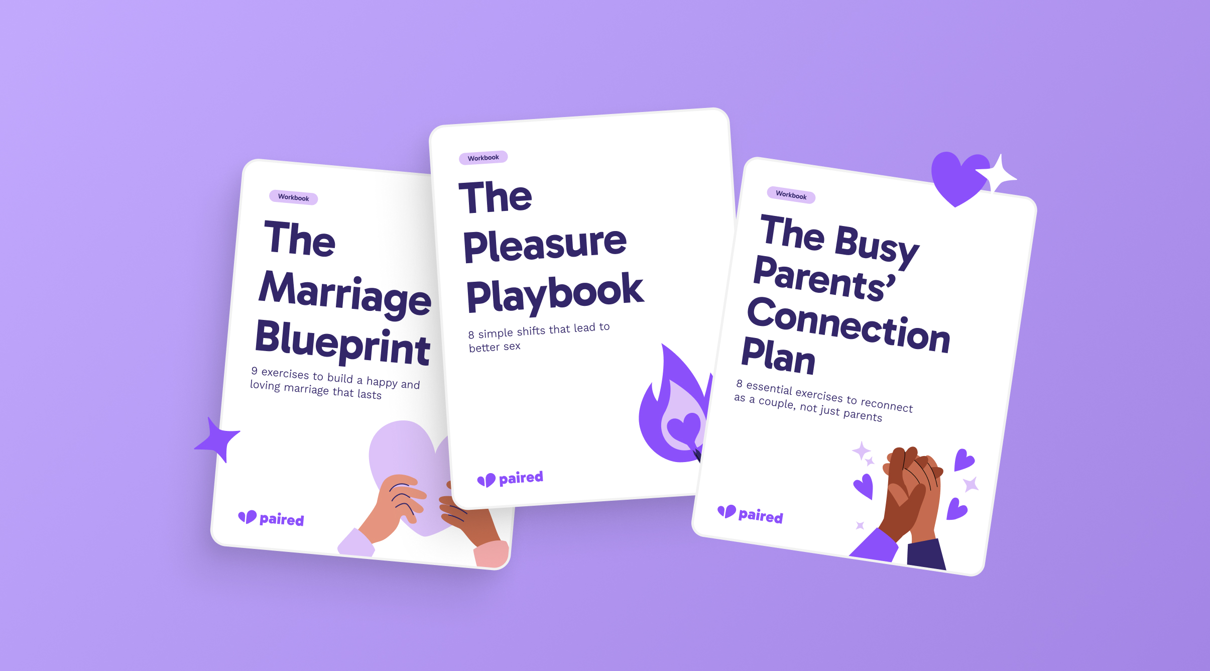
As an in-house designer I was asked to design 3 themed workbooks to extend the experience beyond the app and add extra value to couples. I created 3 PDFs that couples could use together at home, with exercises developed by a relationships expert. Each designed to be both print-ready and fully editable on screen.
This was the first time this type of product had been created at Paired. The main challenges were maintaining visual consistency across three workbooks designed sequentially, managing multiple iteration rounds with the content team and relationships expert, and ensuring the final files worked for both print and screen.
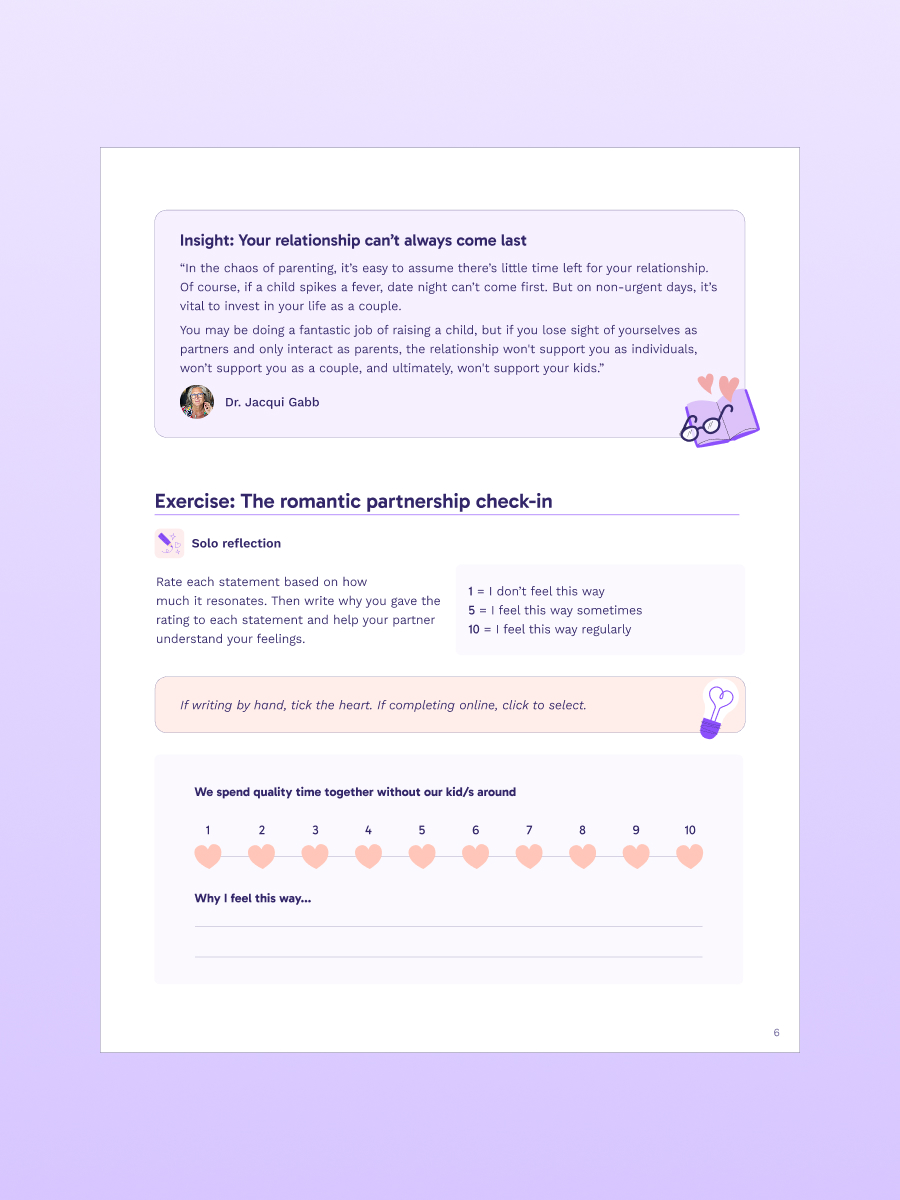
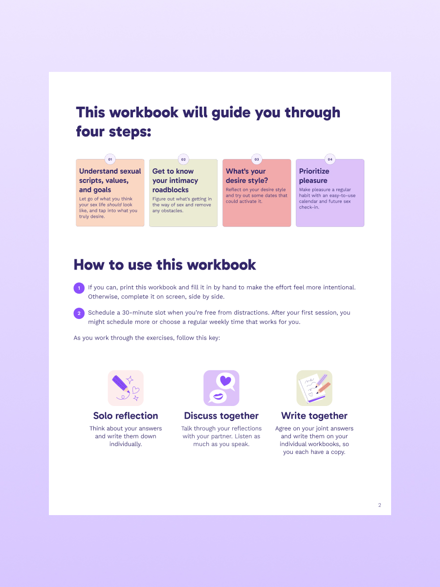
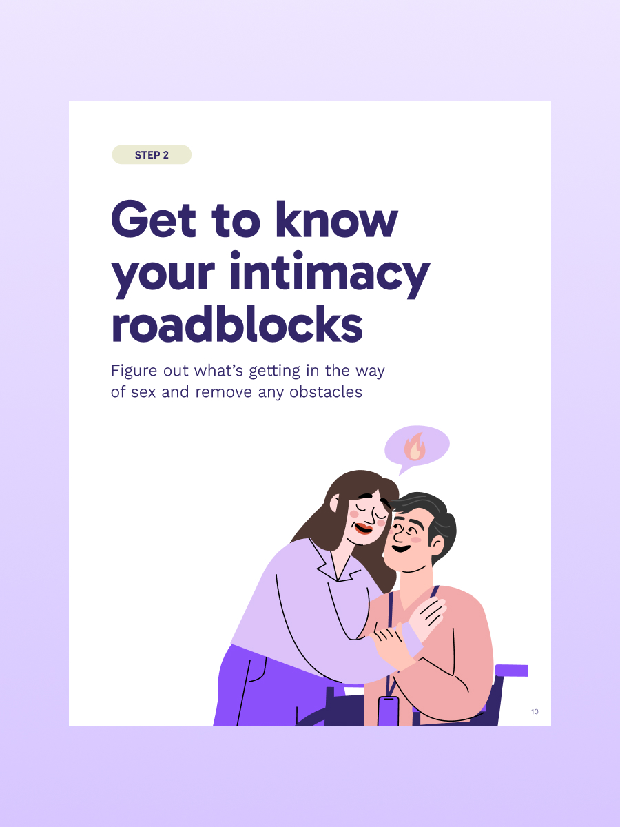
Sample page
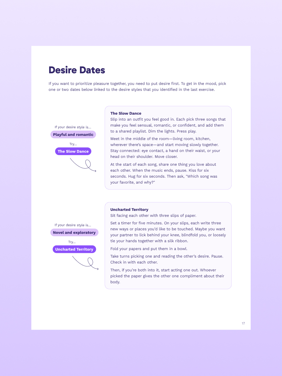
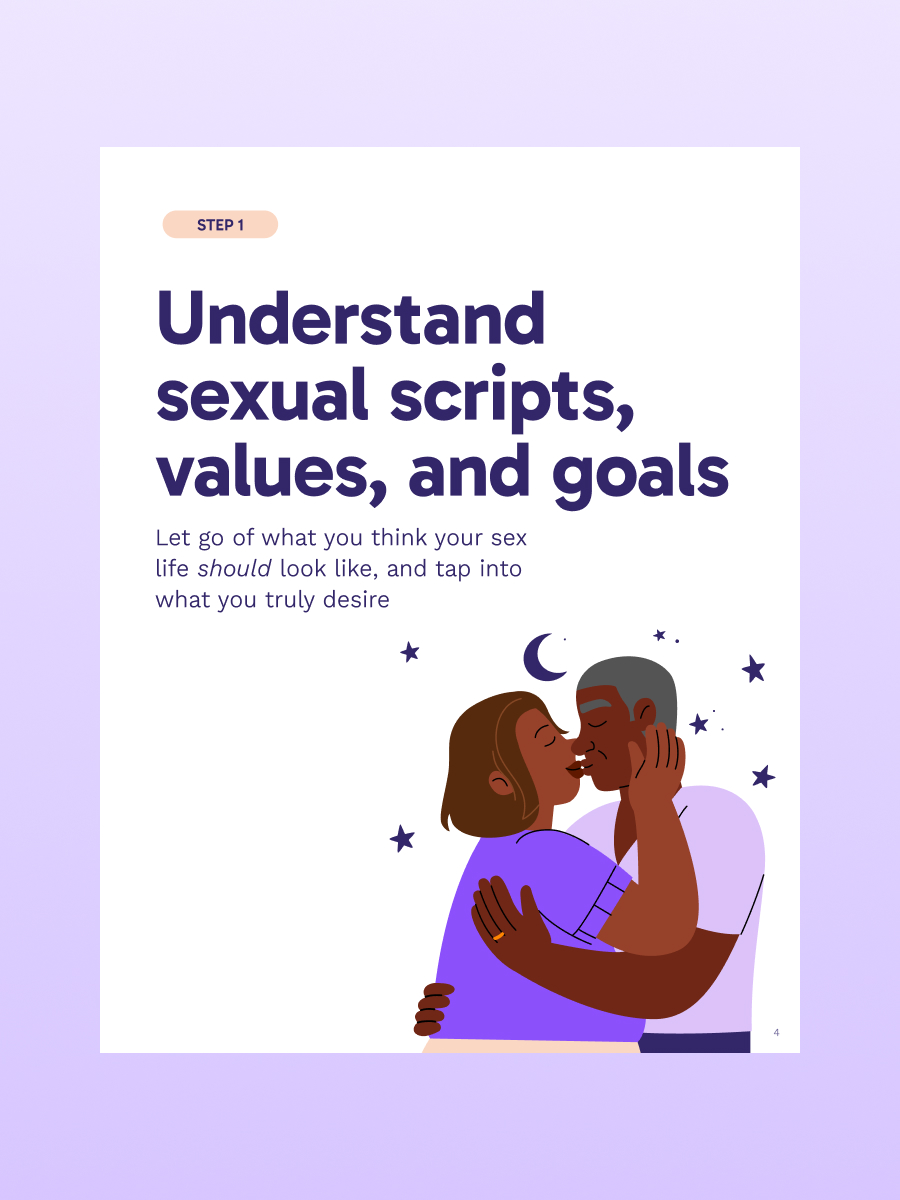
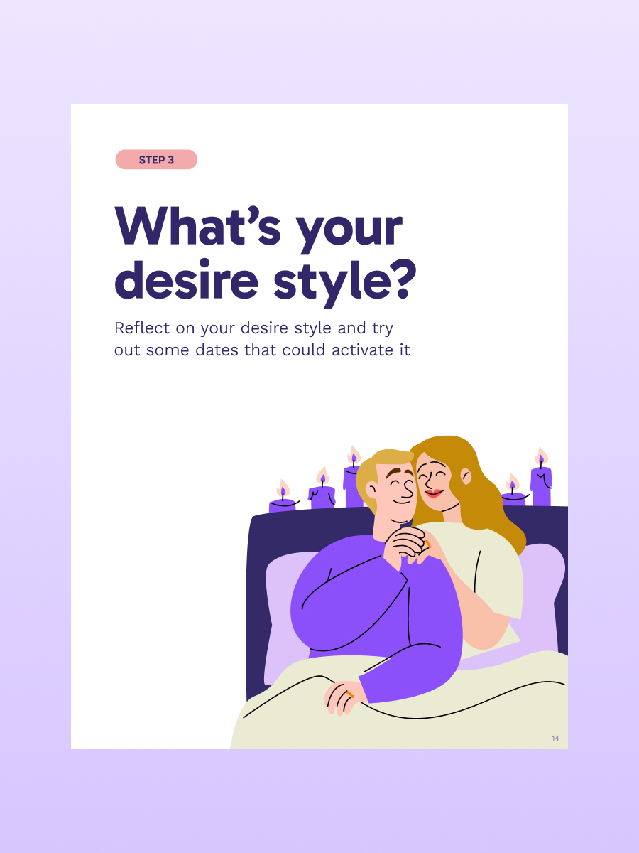
Sample page
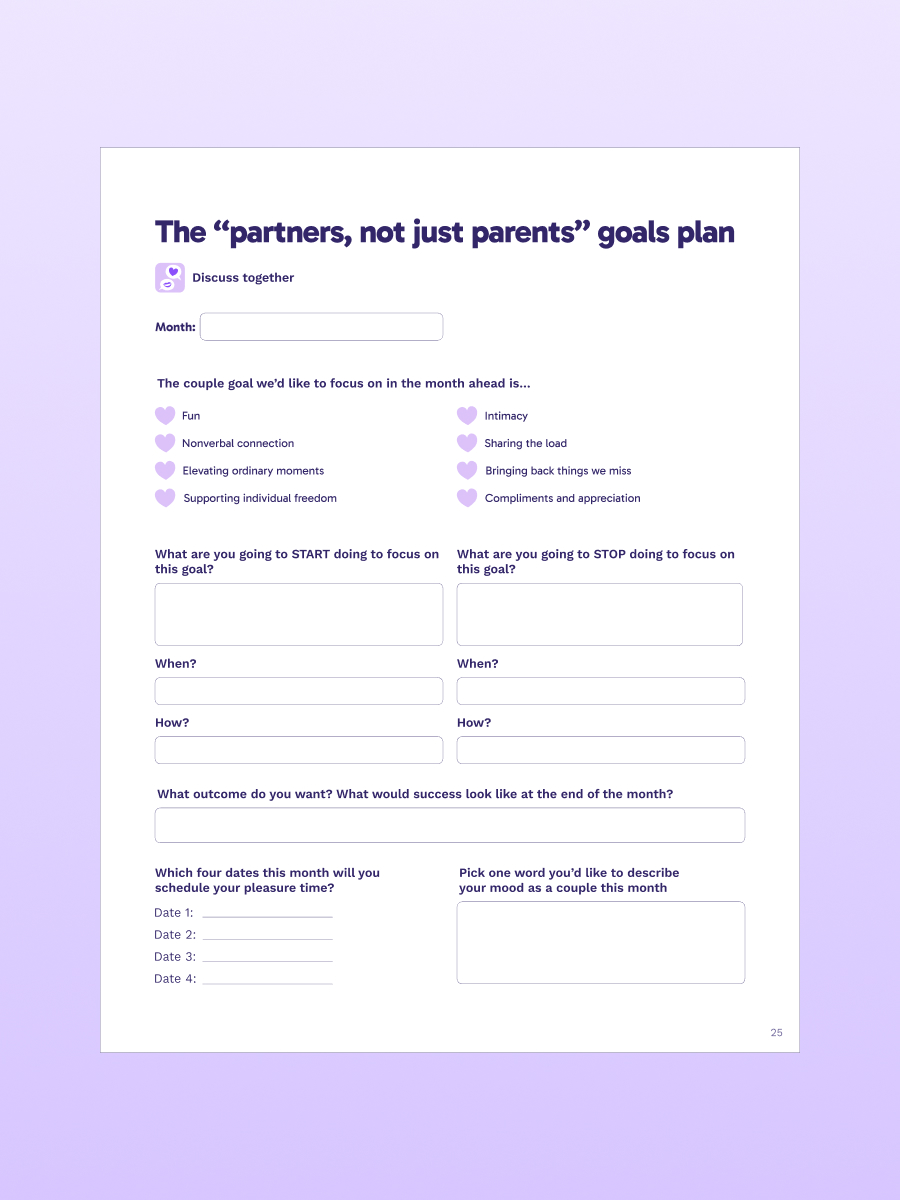
Sample page
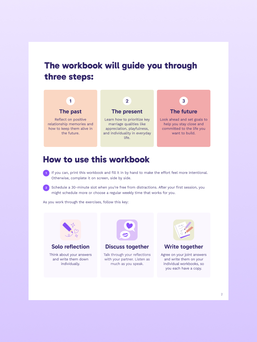
Inconsistent page
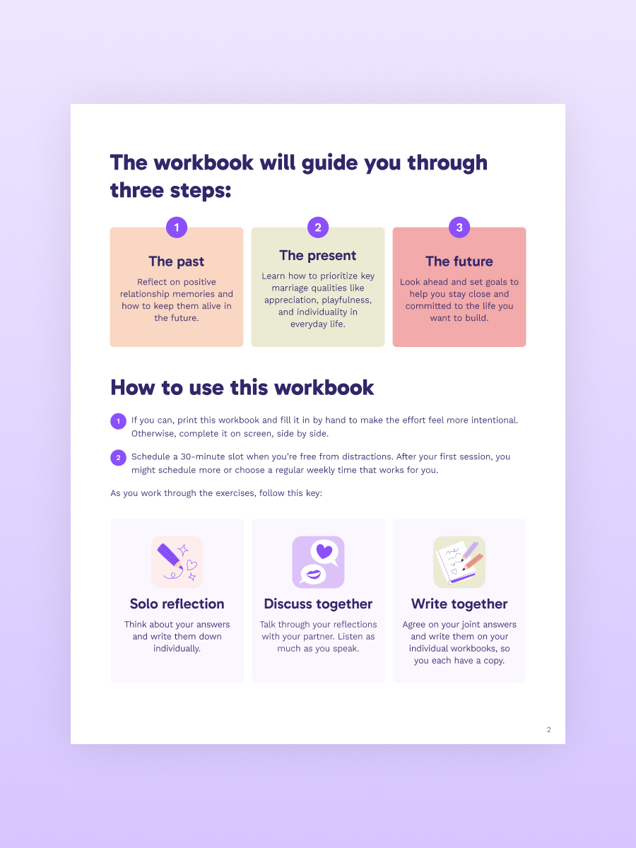
Inconsistent page
Unified style for the workbooks
Use of illustration
Use of illustration
Use of illustration
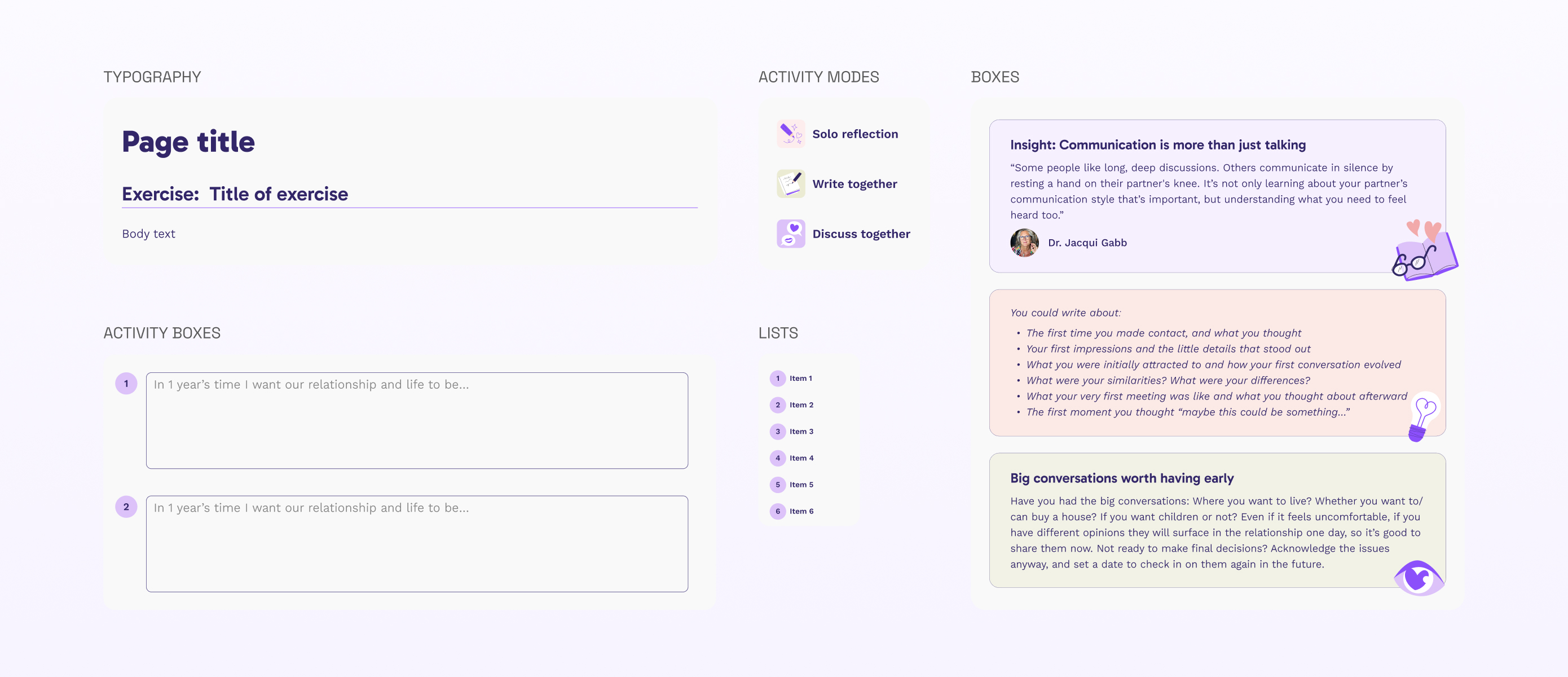
Sample of design system
Lessons learned